Bag UI
The Bag UI is the root component for any UI prefab that displays information about a Bag. There are two types of Bag UI components, which depend on the type of Bag used:
- Bag List UI: Used for list-like Bags
- Bag Grid UI: Used for grid-like Bags
Lists vs Grids
This documentation focuses on Bags with a List-type, as they are most commonly used. The use of a Grid-type requires a deeper understanding on how each UI component works, but the concepts and components used are mostly the same.
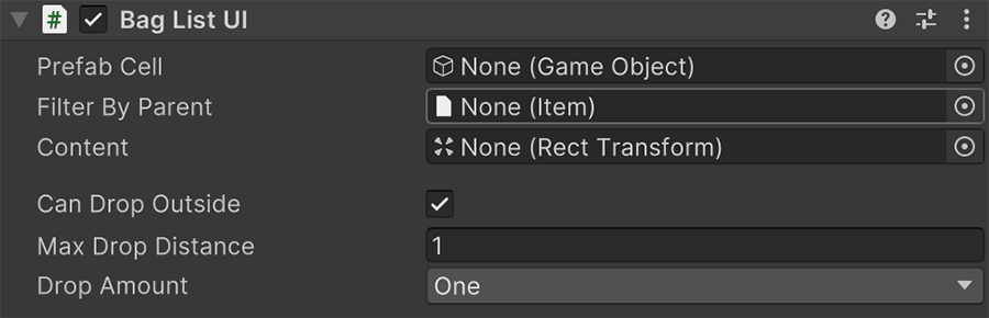
Prefab Cell is a prefab game object with a Bag Cell UI component. This component is automatically instantiated and updated by its parent, for each Item in the Bag displayed.
Filter by Parent is an optional Item-type filter. If none is provided, it will display all Items of all types. This is particularly useful when creating tabs or sections.
Content is the parent game object where all prefab cells will be instantiated - One for each Item in the Bag.
Can Drop Outside determines whether an Item can be dragged outside of the UI canvas to drop it into the scene world.
Max Drop Distance determines the maximum distance that an Item can be dropped from the Bag object.
Drop Amount determines whether a dropped object removes the whole stack of objects or just the top-most.
Dropping Items
Note that only Items that have a Prefab object in their Item definition can be dropped.
Components
There are a few extra components that can synchronize a Bag's information with UI controls, which can either be linked to a Bag, or to the Bag linked to a Bag List/Grid UI component.
Cell UI
This component is automatically set up and refreshed by its Bag List UI or Bag Grid UI parent component.
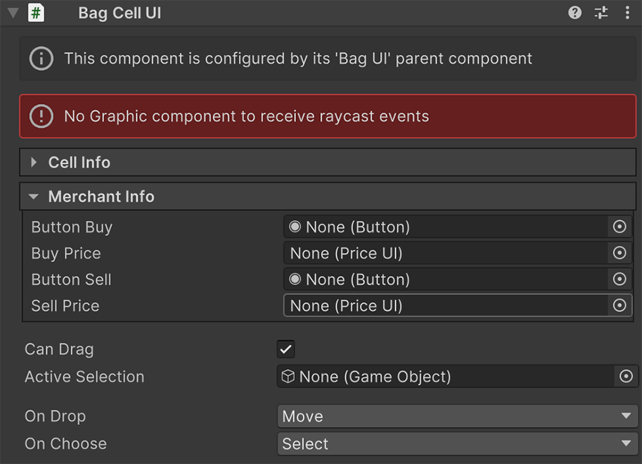
The Cell Info section contains an optional collection of UI control fields that can be plugged in order to be updated when the Item(s) associated with this inventory cell change.
Graphic component required
This component requires a Graphic component (either an Image or a Text) in order to receive input events, such as clicks and drags.
The Merchant Info field is optional and only useful if the Bag Cell UI component is part of a Merchant UI component.
The Can Drag toggle determines whether an Item can be dragged and dropped.
On Drop and On Select defines the behavior when this Item cell is dragged and dropped, and when it is focused.
Selected Cell UI, Socket UI and Property UI
When a Bag Cell UI is selected, any Selected Cell UI component will be refreshed with the information of the currently selected cell. This allows to display information about a particular cell outside from the cell itself.
In both Bag Cell UI and Selected Cell UI components, one can create a prefab with a Socket UI/Property UI component that displays the current sockets/properties.
Equip UI
This component is used for equipping items and assigning consumables to hotbars.
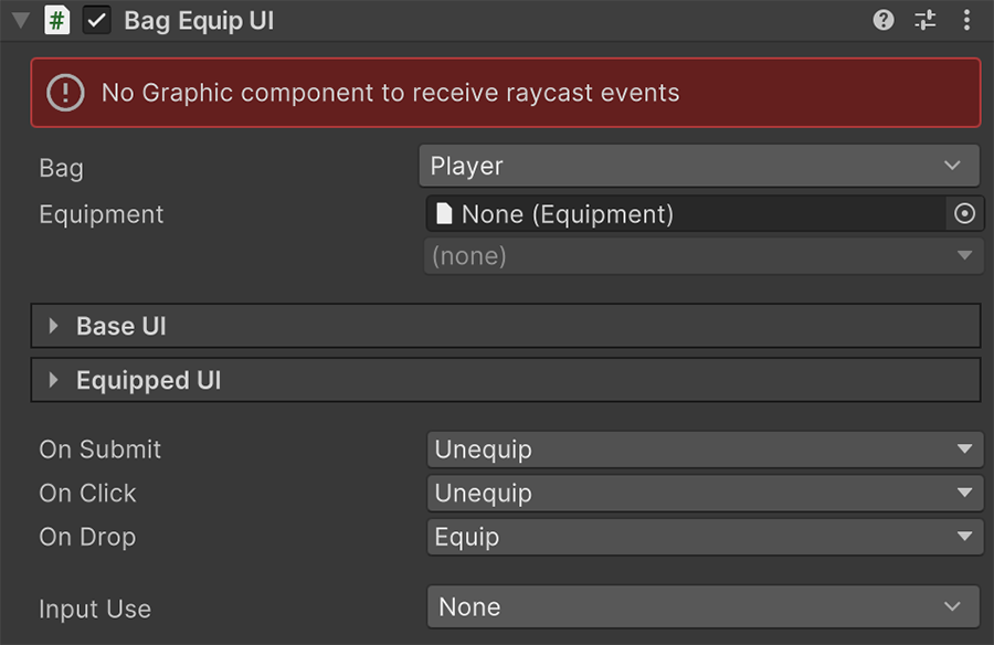
The Bag and Equipment fields determine the targeted Bag and the equipment slot that this refers to.
There are two main sections:
- Base UI: Allows to display a collection of optional controls that reference the base-type Item
- Equipped UI: Allows to display a collection of optional controls that reference the currently equipped Item (if there is one).
The rest of the fields define the behavior when the Bag Equip UI is interacted with.
Wealth UI
The Bag Wealth UI component is used to display the selected Currency and how much of it the Bag carries.
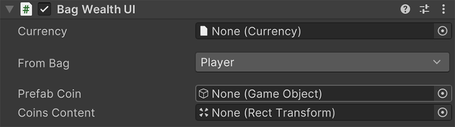
This component requires a prefab that represents each coin's Currency value, and must contain the Coin UI component.
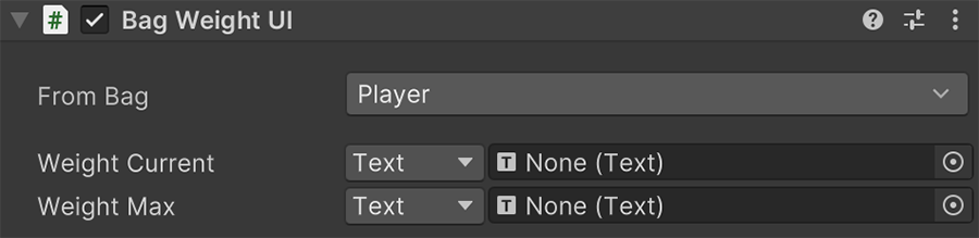
Weight
This component displays the current and max weight of the selected Bag.