User Interface
The Quests module comes with a collection of components designed to streamline the creation of UI windows and elements.
All examples that come with the module have been created with them and are flexible to accommodate any type of window.
Quest List UI
This is one of the most important components and allows to display a list of Quests in a list fashion.
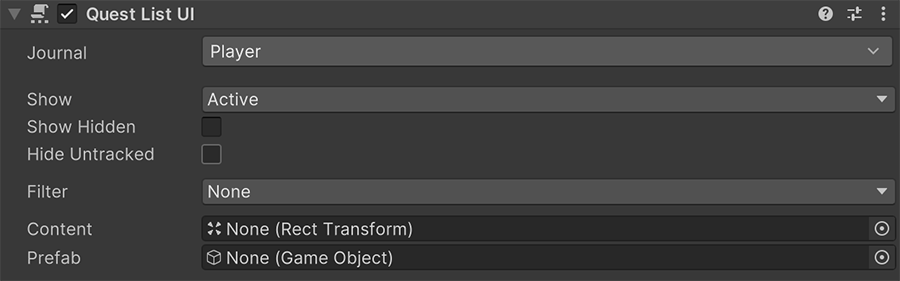
The Journal field determines which component the quests are taken from.
The following fields act as filters to display those quests.
- The Show dropdown allows to display only quests that are in a particular state. For example, display only those that are complete and active.
- The Show Hidden toggle determines whether hidden quests should be displayed or not.
- The Hide Untracked determines if the quests that aren't tracked should be visible or not.
- The Filter dropdown allows to define whether to only display those quests that are present in a Global or Local List Variable. This is useful to display achievements or non-standard quests.
The Content field defines the Rect Transform where each prefab instance will be instantiated, for every visible quest.
Layout component
The Content value should contain an auto-layout component, such as Vertical Layout Group, Horizontal Layout Group or Grid Layout Group.
The Prefab is the prefab instantiated inside the Content. It must contain a Quest UI component, which is automatically configured by its parent.
Quest UI
This component is used in tandem with the Quest List UI to display a list of quests based on a set of rules and filters.
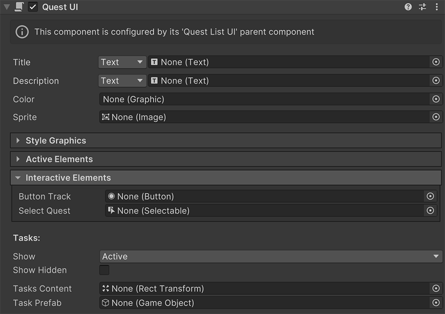
The Title, Description, Color and Sprite fields are all optional and reference the indexed quest's homonymous values.
The Style Graphics section contains a collection of color codes to change the graphics based on different conditions, such as whether a quest is Active, Inactive, Completed, Tracked, etc...
The Active Elements section defines a set of optional game objects that are activated/deactivated according to different conditions.
Show a Tracking Bookmark
It is common to mark the currently tracked quest with an icon or a different color. You can do this by selecting a game object that contains a bookmark image, and drag and drop this element onto the Active if Tracking field.
This will deactivate the bookmark if the quest is not being tracked, and activate it otherwise.
The Interactive elements allow to define different types of interactions performed by the player.
For example, the Button Track field instructs a button to toggle the tracking state of the quest when clicked.
The Select Quest field allows to define a selection element as a button to select this particular quest.
More about Selections
More information about selecting quests and tasks below at the Selection UI section.
The Show and Show Hidden fields work exactly like the ones from Quest List UI but instead of quests, it refers to tasks.
The Tasks Content and the Task Prefab are two optional fields that allow to define a place where to list the tasks of this quest based on the previous filters.
Task UI required
Just like the Quest List UI component requires a prefab with a Quest UI component to configure, the latter requires a prefab with a Task UI component.
Task UI
This component is very similar to Quest UI but instead of working with quests, it does work with tasks.
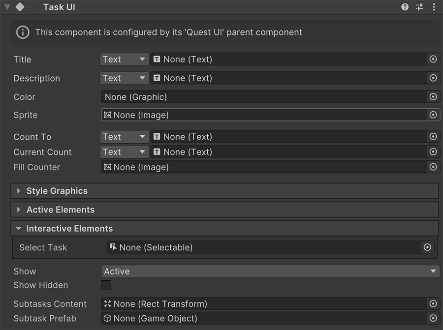
As seen in the upper screenshot, most fields are exactly the same, and only a handful differ.
Selection UI
Upon selecting a quest, any Quests UI component with the Selection keyword will be automatically updated.
The components affected are:
- Selected Quest UI
- Selected Task UI
Both components have the exact same interface as Quest UI and Task UI respectively. But instead of targeting a specific quest or task, they target the currently selected one, and automatically change upon receiving any change or selecting a new one.
Points of Interest UI
The points of interest UI components are all related to the highlighting and location of specific Tasks and scene objects around the scene.
For example, displaying a minimap where dots appear around a certain radius, or floating indicators as an overlay over the camera.
Minimap UI
This component is used to display a rectangle and displays nearby points of interest within a certain radius.
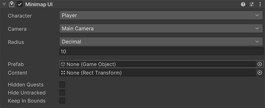
Each Prefab field must contain a Minimap Item UI component, which is configured by this component.
Changing Radius
The radius of the minimap can be changed at runtime, and can be increased when the player goes at a high speed, or even as an unlockable skill that allows to view further away.
Compass UI
The Compass UI is a thin line that usually appears at the top of the screen, and displays the direction of points of interest from the camera's point of view.
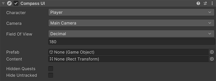
The Character field determines the origin of the compass, and the Camera field the forward direction to be considered.
Each Prefab field must contain a Compass Item UI component, which is automatically configured by this component.
Indicators UI
The Indicators UI component displays floating images on top of the interface that shows the exact position of the point of interest.
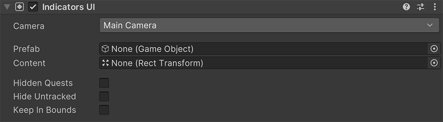
The Keep in Bounds field determines whether indicators should stay at the edge of the screen when the world space instance is off-screen.
Each Prefab field must contain a Indicator Item UI component, which is automatically configured by this component.